Choose “ITUPDOWN” as your digital marketing agency and propel your business to new heights with our services digital marketing materials and our proprietary technology platform. Our business is to provide strategic digital solutions. our creation, Since we have developed more than 100 websites that allow brands to connect with their audience in a way relevant and meaningful.
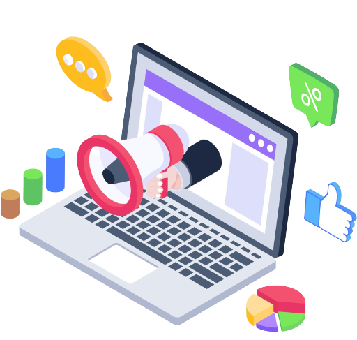
Smart digital marketing includes many sub-services. Our main goal is to choose the most efficient and get the best result.
LOCAL SEO
Even as modern businesses set off on a path of global dominance, they need to remember that unless they’re able to build brand value at home, they won’t be able to effectively engage international customers, especially if they specialize in geo-specific services.
WEBSITE DESIGN
We have a talented group of website designers who can build you a site that looks great, shows up on Google search pages and brings new customers to your digital doorstep.
WEBSITE DEVELOPMENT
Web development services help create all types of web-based software and ensure great experience for web users. At ItUpDown , we professionally design, redesign and continuously support customer-facing and enterprise web apps to achieve high conversion and adoption rates.
Technical SEO
For every second of delay in your page load time, your bounce rate increases and you’re losing valuable leads. Improve your website performance and capture high-quality leads and traffic with ItUpDown The Digital Marketing Agency’s technical search engine optimization (SEO) services.
CONTENT WRITING
ItUpDown is also a content writing service provider and is the voice of your business in the online digital world, to explain to your customer that what your website, products, or services is all about. Because we know that in the online world content is the heart and soul of your business.
WEBSITE AUDIT
Not all websites are created equal. Some websites have been up for years unchanged; some use content management systems that do not accommodate good SEO practices; some are built by designers who do not have the background in site architecture that boosts the visitor experience. In summary this is why you need a website audit:
Ecommerce Website Development
We offer you industry leading e-commerce web design and development solutions customized according to the nature and size of your business. We have exceptional design and development teams that combine their creative genius with the powerful capabilities of some of the biggest ecommerce platforms in the world.
GOOGLE ADS
If you’re looking to use Google to push your business to the top, you’ve come to the right page. As a certified Google Partner agency, Global Media Insight has been operating for over 21 Years. Local or global, big or small, it pays to advertise your business on Google. As the world’s most-used search engine, it’s the greatest source of customer traffic, greater visibility and overall credibility.
SOCIAL MEDIA MARKETING
Are you tired of getting the same unsatisfying results from your social media strategy? Don’t settle for any less. You can do better on these social media platforms! With our social media services, you can be sure that every penny you spend on a social media campaign will generate the results that you wanted and more. Hit the button below to talk to us today.
About Search Engine Optimization
Why Start?
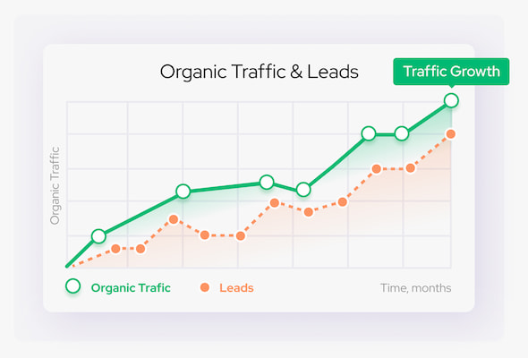
With excellent and professional SEO organic results, your brand project is sure to move and grow successfully ensuring recognition and development of the maximum number of clients.
This will improve business visibility and branding, providing your business with credibility and unmatched insight into your customers. SEO is the cheapest and most popular form of advertising from a public point of view in comparison to others
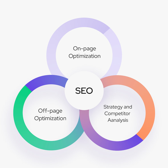
What is SEO?
Search Engine Optimization (SEO) is a strong and predominant form of website promotion, technique methods to get a lot of customers and market interest to your website. This is implemented by gaining and maintaining top rankings on all various search engines such as Bing, Google, Yahoo, Yandex.
SEO includes a huge range of works: keyword research and stuffing, competitor analysis and SEO strategy, website SEO audit, link building, copywriting, meta tags optimization, usability improvements, XML sitemap, status code monitoring, code validation, and etc. Successful implementation of these techniques creates stronger SERP results and increases search ranking and targeted organic traffic.
Quality and Robust Online Reseller Services
Sourcing a reliable reseller service is an easy way to ensure your clients are receiving outstanding services, without having to hire new employees or struggle with the workload.
How Much SEO Services?
Prices for our SEO services depends on many factors, such as competition, amount of keywords, age & quality of the website
We are here to offer you a qualified SEO team who are ready to promote your website at any time. Every project is treated equally by a well-structured team of professionals including project manager, analyst, SEO expert, copywriter, PR manager, link manager, designer, coder, programmer, and a dedicated account manager. Our employees have several years of experience in the field of SEO and challenging expertise in the world of Online Marketing.
Of course, you can hire a specialist and pay him a salary of about 500 – 100$ to do the entire project, but he will never be able to physically & mentally provide you the same amount of works as an SEO company.
The cost of services from ItUpDown agency starts from 300$ per month for 40 keywords. We create a strategy of systematic work for every client proposal, promising monthly updates and reports from Google to enable you to track your website positions.
Also, we have a unique SEO plan – “Payment After Results”. You will start to pay only after achieving a 1st-page position on a search engine.
If you want to learn Search Engine Optimization you can try our advanced SEO training.
Why Our SEO Company?
For several years in a row, we are the best SEO company with popular ratings – Clutch, TOPSEOs, 10SEOs. Our website holds the top-3 position for all popular keywords in the niche.
More than 50+ websites on the 1st-page of organic search results
We have much experience in SEO and Online Marketing
Half Payment in Advance
We can offer a unique strategy. Only Half Payment in Advance. You will pay for top results only
100% Guarantee
We promise to get the first page positions on search engine within 3-6 months. This is true for monthly payment strategy
Online Reporting 24/7
Access to 24/7 online report system, that gives you real-time data. You can track SEO results by yourself
Eleven Years of Experience
We have started our SEO firm in 2019. Search Engines are changing their algorithms and formulas quite often. We have the unique techniques and methods to keep up with those changes and to help us provide uninterrupted results for a long time
Dedicated Account Manager
We provide you a dedicated account manager that will work with you to maximize your communication between all our SEO and web development departments
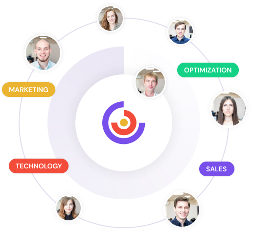
Our Team
Our talented and diverse team works together for one purpose to unlock the potential of those around us.
Samy- Digital Marketing
Muhammad Usama is a digital marketing specialist content leader and content leader and Head of leads generation. He has more than 5 years of projects management experience.
Muhammad - Developer
Experienced software developer with 3+ years of experience in the industry. Proven ability to design, develop, and deliver high-quality software solutions.